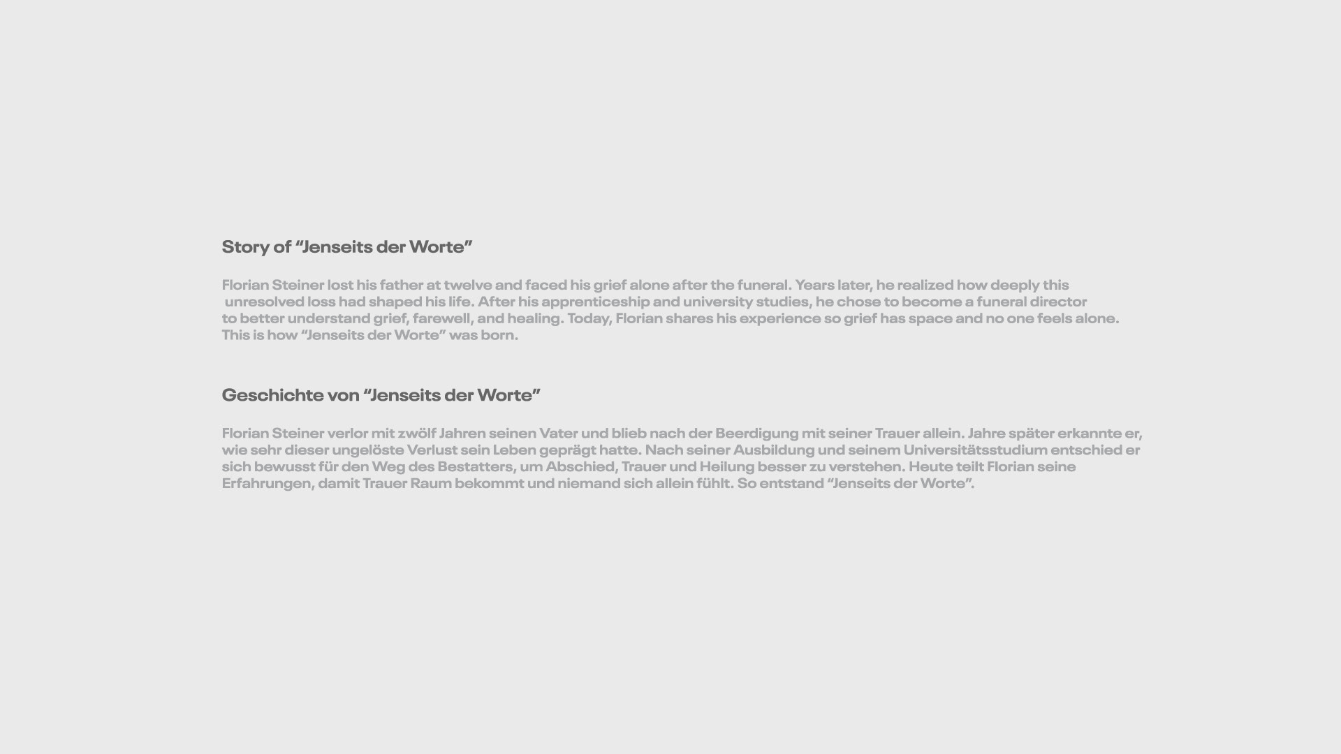
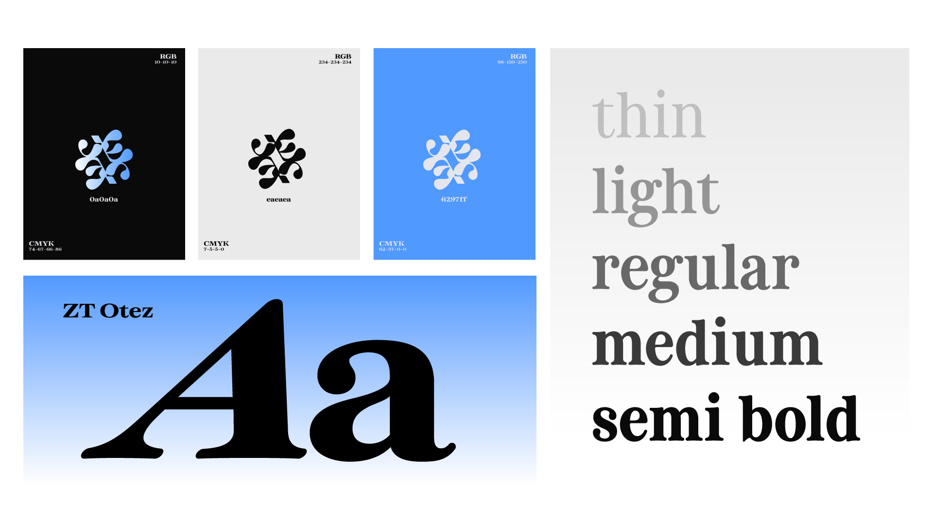
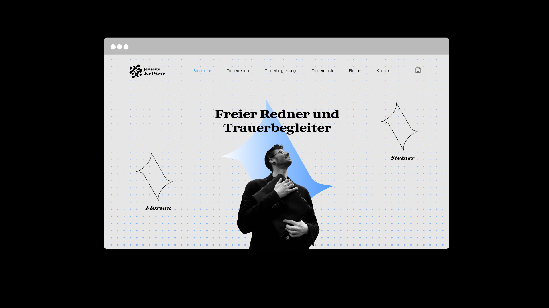
For this brand, I created a complete visual identity including logo design, brand system, and web design. The project required a conscious move away from conventional branding, as the subject matter of farewell, grief, and remembrance calls for sensitivity and restraint. Instead of using literal or commonly expected symbolism, I chose a more thoughtful and reduced visual approach.
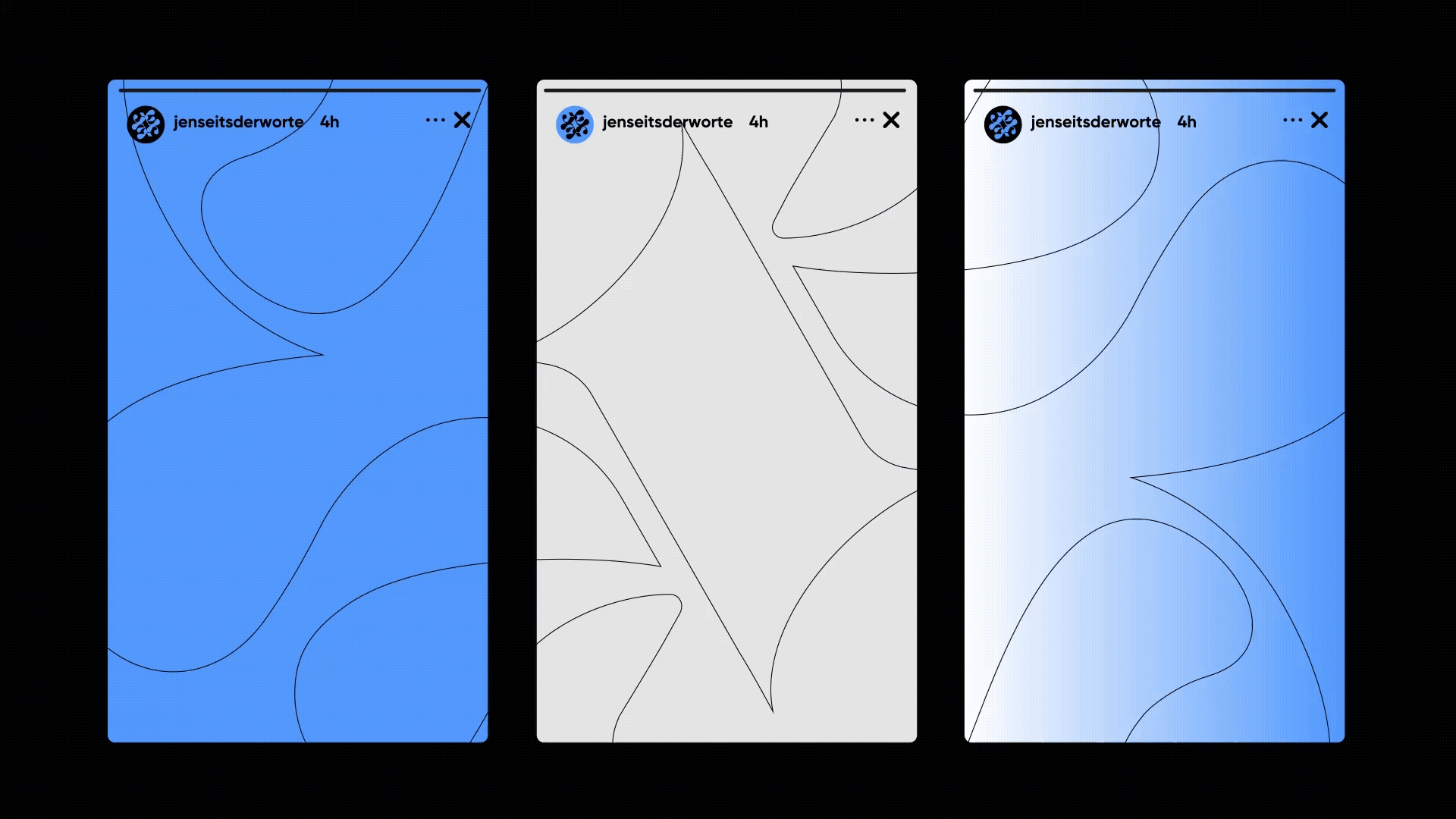
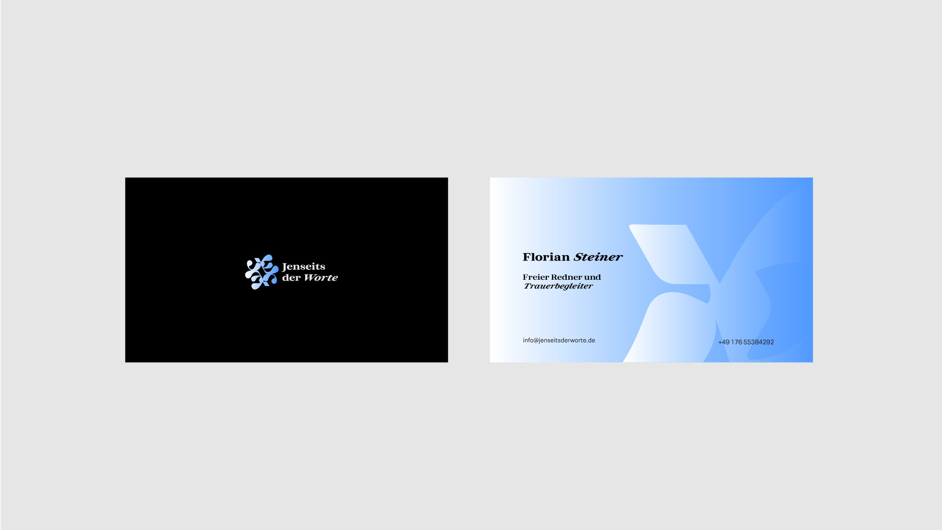
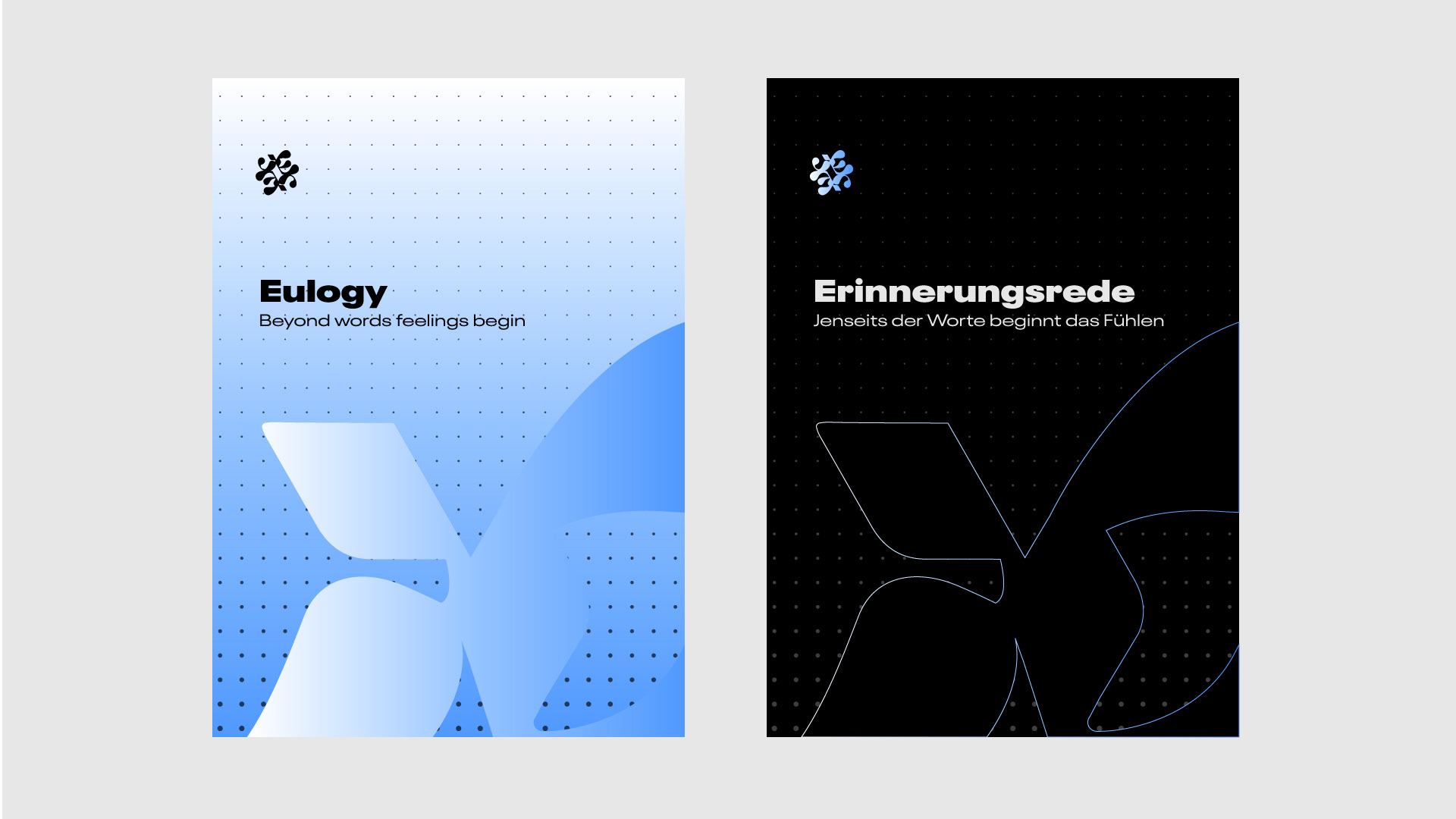
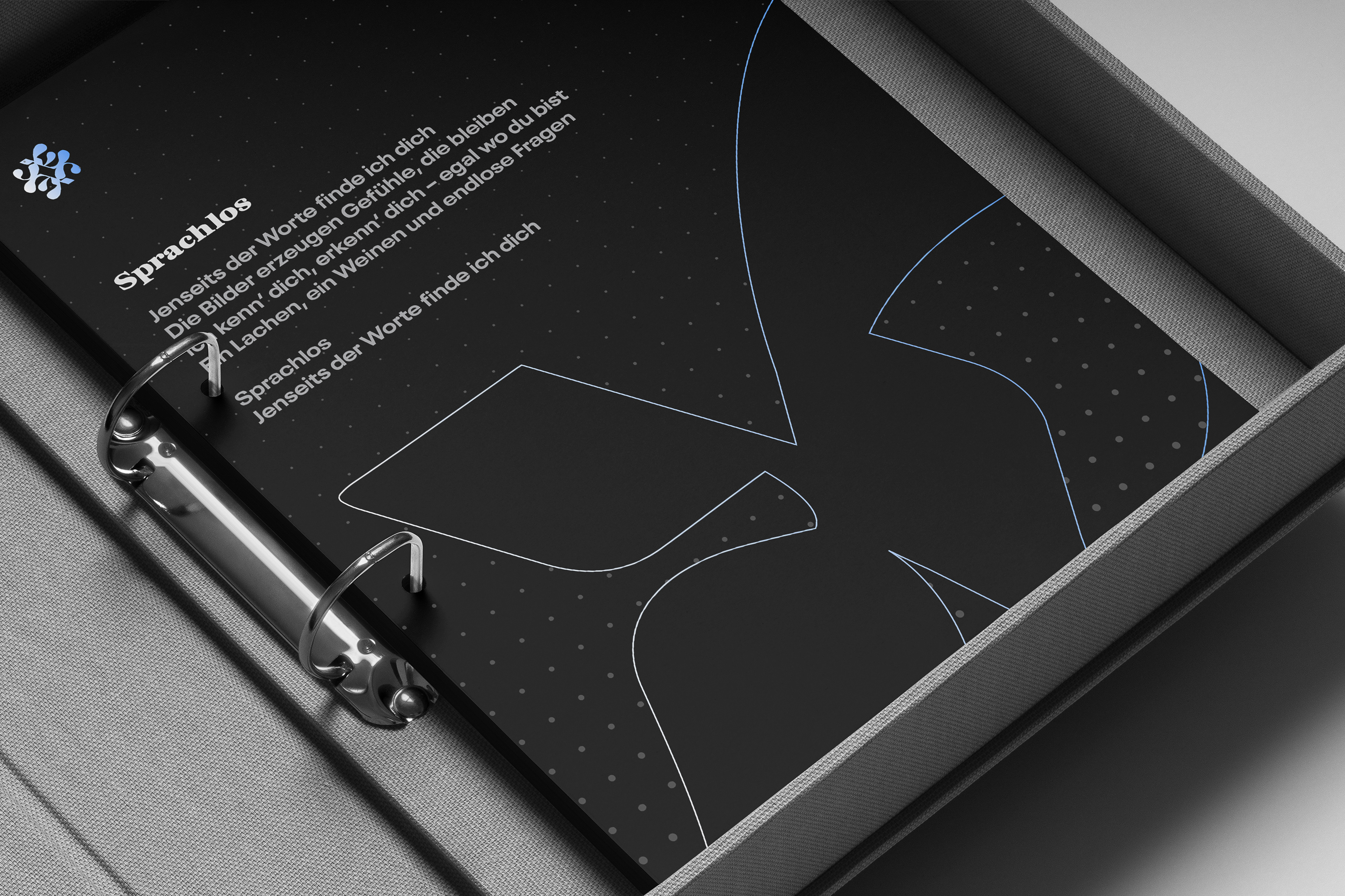
The logo is built around an abstract form derived from the combined initials J and W, shaped into a distinctive and unified mark. This abstraction allows the identity to feel personal and reflective without becoming too explicit, keeping an emotional connection while leaving space for interpretation. Based on this core shape, a flexible set of brand key visuals was developed, allowing the identity to work consistently across different applications.
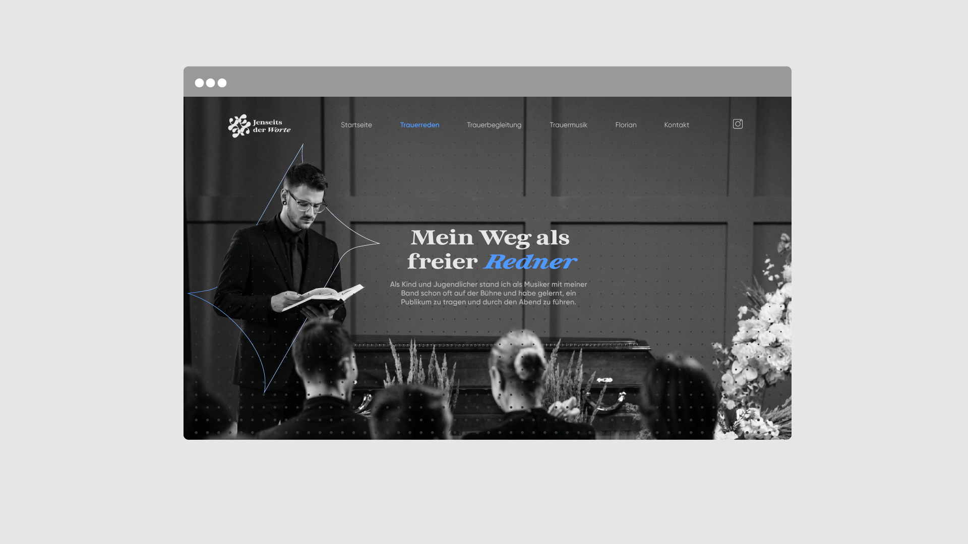
The final result balances abstraction and closeness. It is calm, respectful, and emotionally aware. Together with a restrained web design, the visual identity supports the brand’s intention of creating space for meaning, reflection, and expression beyond words.